DSPRelated.com
Plotting Discrete-Time Signals

Plotting Discrete-Time Signals

Neil Robertson
TimelessBeginner

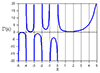
A discrete-time sinusoid can have frequency up to just shy of half the sample frequency. But if you try to plot the sinusoid, the result is not always recognizable. For example, if you plot a 9 Hz sinusoid sampled at 100 Hz, you get the result shown in the top of Figure 1, which looks like a sine. But if you plot a 35 Hz sinusoid sampled at 100 Hz, you get the bottom graph, which does not look like a sine when you connect the dots. We typically want the plot of a sampled sinusoid to resemble its continuous-time version. To achieve this, we need to interpolate.


Summary

This blog explains why sampled sinusoids can look unintuitive when plotted and shows how interpolation and simple multirate techniques make discrete-time plots resemble their continuous counterparts. The reader will learn practical plotting and reconstruction approaches to produce recognizable sinusoidal waveforms from sampled data.

Key Takeaways

  • Explain why high-frequency discrete-time sinusoids can appear non-sinusoidal when plotted by connecting sample points.
  • Demonstrate interpolation methods (zero-order hold, linear, and sinc/ideal) to reconstruct and visualize continuous-like waveforms.
  • Show how upsampling plus lowpass filtering (multirate reconstruction) recovers the expected waveform shape.
  • Provide practical MATLAB plotting tips and code examples to generate clear visualizations of sampled signals.

Who Should Read This

Engineers, students, and practitioners who work with sampled signals and need practical guidance on visualizing and reconstructing discrete-time waveforms.

TimelessBeginner

Topics

Filter DesignMultirate SystemsMATLAB/Simulink

Related Documents