


Understanding the Nyquist frequency when doing complex FFT
Hi,
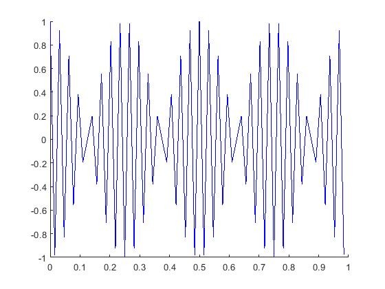
I'm working on shift algorithm in MATLAB. My selected sampling frequency is 64Hz. I created a complex time domain signal with a frequency of 30Hz. As far as I understand, then this should be just below Nyquist frequency limit and so produce no aliasing in time domain or frequency domain. However, when I plot my time domain signal I get a weird seemingly modulated signal. Do me it seems that there is some aliasing taking place, but I do not understand why. I've also found that up to 1/4 of sampling frequency the input signal plotted is as expected, after that the 'aliasing' effetc starts to take place.
My plotted signal
The code is as follows:
N = 64; %number of samples
t_vec =(0:1/N:1-(1/N)); % time values
A3=1;
f3=30; % signal frequency

y = (A3*exp(1i*2*pi*f3*t_vec));

figure
hold

plot(t_vec,real(y), 'b')
title('Original signal'
The Nyquist limit doesn't guarantee reproduction, only the lack of aliasing. Consider a sine wave of 32Hz sampled perfectly synchronously at 64Hz at the zero crossings. The resulting samples will be a perfect sequence of zeroes and reconstruct as nothing. OTOH, if the sampling isn't perfectly synchronous, the samples will eventually pick up the full amplitude of the original signal and the proper filter can recreate the original signal. However, in no case does the signal show an alias. Your modulation isn't an alias, it's modulation caused by sampling too close to the Nyquist limit.
I'm surprised Tim Wescott didn't link to his excellent paper: Sampling: What Nyquist Didn't Say And What To Do About It. From the paper: "the Nyquist rate isn’t a line in the sand that you can toe up to with complete safety. It is more like an electric fence or a hot poker; something that won’t hurt you if you keep your distance, but never something you want to saunter up to and lean against."

Actually, the usual way I see Nyquist expressed is that if you are strictly below the limit, then you can perfectly reconstruct. What's not mentioned is that if you are \(\epsilon\) below the limit, then reconstruction will need a delay on the order of \(1/\epsilon\).
So in the limit as \(\epsilon\) goes to zero, you can reconstruct, you just need to be really patient.
What you show is what I expect with or without co mplex signal or frequency or whether plotting real part, imaginary part or even magnitude. The plot is of samples not in any way a reconstructed signal. Consider a limiting case of a signal at exactly the Nyquist frequency. If the first sample is at a zero crossing all the samples are at zero crossings making the sampled signal exactly 0. If on another hand the first sample is at positive maximum the samples will alternate between positive and negative extreme values. When the signal frequency is slightly less than Nyquist you get exactly what you did.
Years ago we got some help from Electrical Engineering faculty when we found out about Nyquist frequency and were advised to sample 5 times faster than the that minimum.
The sampling theorem requires the signal frequency content to be less than half the sampling rate. The sampling theorem gives the limiting possibility. That the signal starts and stops adds frequency components that extend to infinity making the sampling theorem strictly speaking inapplicable. Practical workarounds are sampling fast enough and long enough to get results good enough. And/or do lots of number crunching.
Hello Ronnu,
You are mistaking an artifact for aliasing. The artifact is tied to your thinking that one can approximate a smooth signal by straight lines connecting adjacent sample points. We can do this if the signal is significantly oversampled. can't do it if the successive samples are not highly correlated which, for your example, happens when you only take a few samples per cycle. Playing connect the dots requires significant oversampling of signal. If not oversampled, one needs a better interpolator, higher order polynomials are one option, but so is the cardinal interpolator, the sinc function.
run attached matlab to better see the connect the dot problem.
.N = 64*1; %number of samples
t_vec =(0:1/N:1-(1/N)); % time values
A3=1;
f3=30; % signal frequency
y = (A3*exp(1i*2*pi*f3*t_vec));
figure(10)
plot(t_vec,real(y), '-bo','linewidth',2)
hold on
plot(0:1/256:1-1/256,cos(2*pi*(0:255)*30/256),'r','linewidth',2)
hold off
grid on
title('Original Signal sampled at low rate and at 4-times higher rate')
axis([0 0.5 -1.2 1.2])
set(gca,'XTick',[0:1/32:0.5])
fred h

It is not a problem at all. Had you also plotted the imag(y), and then abs(y), you would notice similar behavior in the imag (though shifted in phase), and abs(y) would show up as a solid, steady, DC value of '1'.
Nyquist did not say that when you plot your sampled signal on paper it will look like your continuous-time signal -- he just said you'd be able to reconstruct it with a sufficiently sharp filter.
If you were to do an FFT of what you plotted, you should find that it's nearly zero everywhere except for bin 30 and bin 34. If you do an FFT on your complex signal, it should be zero everywhere except for bin 30 (or possibly bin 34, depending on whether the frequency is negative as seen by your FFT -- I always screw that up).
If you really are using complex data and just not showing the quadrature part, then in theory the Nyquist rate for a 30Hz signal is 30Hz, because you're getting two independent (inphase and quadrature) numbers per sample. But sampling a 30Hz complex signal at 64Hz gives nice headroom.

try this !!!
N = 64; %number of samples
t_vec =(0:1/N:1-(1/N)); % time values
tk = (0:1/512:1-1/512); % continuos time
A3=1;
f3=30; % signal frequency
y = (A3*exp(j*2*pi*f3*t_vec));
yk = A3*exp(j*2*pi*f3*tk);
figure(1)
stem(t_vec,real(y), 'b')
hold on;
plot(tk,real(yk), 'k')

There is nothing wrong but the title. Your observation applies to real signal as well.
You have not done any fft? if you do fft you will see a line of frequency. Yes visually it does not look that nice familiar sine waveform.
you can scan through frequency range in below equation:
f = [32,31,30,29,12,10,3];
y = cos(2*pi*(0:63)*f(1)/64); %try f(2),f(3)...etc
plot(y);
yup = resample(y,4,1);
plot(yup);
Note that you created a complex sinusoid, y, but are only plotting the real part. So you are plotting a real sinusoid, not a complex one. As has been stated, you are not observing aliasing, but the effect of discritization, which means that the original content can be reconstructed.
Something that is interesting about your plot is that it looks like an amplitude modulated sinusoid. Your plot is linearly interpolating between samples, which makes it a (albeit poor) continuous time representation of the discritized signal. Linear interpolation is not near sufficient for filtering out content above nyquist. So, we know the discritized signal has frequency content reflected about the nyquist frequency. This means that there are peaks at 30Hz and 34Hz. This means that this signal is roughly equivalent to the sum of 30Hz and 34Hz sinusoids. The sum of two sinusoids is equivalent to the product of two sinusoids, and this signal is roughly equivalent to a 32Hz sinusoid modulated with a 2Hz sinusoid. I believe you can verify that by inspection.
And I think that’s pretty neat
function mist1
N = 64; %number of samples
t_vec =(0:1/N:1-(1/N)); % time values
tk = (0:1/512:1-1/512); % continuos time
A3=1;
f3=30; % signal frequency
y = (A3*exp(j*2*pi*f3*t_vec));
yk = A3*exp(j*2*pi*f3*tk);
figure(1);
stem(t_vec,real(y), '-b', 'LineWidth',1)
hold on;
plot(tk,real(yk), '-k', 'LineWidth',1)
hold off;
% Reconstarction with sinc-functions
figure(2);
plot(tk, sinc_t(tk-0.5, 1/N));
y_matrix = zeros(length(t_vec),length(tk));
for k = 1:length(t_vec)
y_matrix(k,:) = sinc_t((tk-t_vec(k)),1/N).*real(y(k));
end;
y_rec = sum(y_matrix);
figure(3);
subplot(211), plot(tk, real(yk));
title('Continuos signal'), grid on;
subplot(212), plot(tk, y_rec);
title('With sinc-function reconstructed signal'), grid on;
%##############################
function [y_sinc] = sinc_t(t,T);
y_sinc = sinc(t/T);
Thank you for sharing this. Would you be able to post an image of the generated plot as well? I feel like it would be an illustrative example
I changed figure(3):
figure(3);
subplot(211), plot(tk, real(yk));
title('Continuous signal'), grid on;
subplot(212), plot(tk, y_rec);
title('The samples and with sinc-functions reconstructed signal'), grid on;
hold on
stem(t_vec, real(y),'k');
hold off
Awesome! Thank you